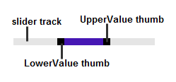
RangeSlider for UWP includes the C1RangeSlider control, a simple input control that moves beyond the typical slider and includes two thumbs for selecting a range of values. When you add the C1RangeSlider control to a XAML window, it exists as a completely functional slider control which you can further customize. The control's interface looks similar to the following image:
